Monday, November 25, 2013

Lakshman Palitha's invitation is awaiting your response


Lakshman Palitha would like to connect on LinkedIn. How would you like to respond?


Lakshman Palitha
UI Engineer at Calcey Technologies


You are receiving Reminder emails for pending invitations. Unsubscribe.
© 2013 LinkedIn Corporation. 2029 Stierlin Ct, Mountain View, CA 94043, USA.


Monday, November 18, 2013

Lakshman Palitha's invitation is awaiting your response


Lakshman Palitha would like to connect on LinkedIn. How would you like to respond?


Lakshman Palitha


You are receiving Reminder emails for pending invitations. Unsubscribe.
© 2013 LinkedIn Corporation. 2029 Stierlin Ct, Mountain View, CA 94043, USA.


Wednesday, November 13, 2013

Invitation to connect on LinkedIn

 
LinkedIn


From Lakshman Palitha
 
--
Sri Lanka


I'd like to add you to my professional network on LinkedIn.

- Lakshman


You are receiving Invitation to Connect emails. Unsubscribe
© 2013, LinkedIn Corporation. 2029 Stierlin Ct. Mountain View, CA 94043, USA
 

Monday, October 14, 2013

Lakshman Palitha's invitation is awaiting your response


Lakshman Palitha would like to connect on LinkedIn. How would you like to respond?


Lakshman Palitha


You are receiving Reminder emails for pending invitations. Unsubscribe.
© 2013 LinkedIn Corporation. 2029 Stierlin Ct, Mountain View, CA 94043, USA.


Monday, October 7, 2013

Lakshman Palitha's invitation is awaiting your response


Lakshman Palitha would like to connect on LinkedIn. How would you like to respond?


Lakshman Palitha


You are receiving Reminder emails for pending invitations. Unsubscribe.
© 2013 LinkedIn Corporation. 2029 Stierlin Ct, Mountain View, CA 94043, USA.


Wednesday, October 2, 2013

Invitation to connect on LinkedIn

 
LinkedIn


From Lakshman Palitha
 
--
Sri Lanka


I'd like to add you to my professional network on LinkedIn.

- Lakshman


You are receiving Invitation to Connect emails. Unsubscribe
© 2012, LinkedIn Corporation. 2029 Stierlin Ct. Mountain View, CA 94043, USA
 

Wednesday, September 25, 2013

Top 10 Free Responsive Image Galleries/Slideshows

If your website relies heavily on images, then having an image gallery is a great way to showcase your content on your website. Having said that, this idea may also backfire if visitors are coming from a mobile or touch device. Mobile users deserve some love too, hence the purpose of today's post.

responsive galleries

There are a variety of responsive image galleries, slideshows and sliders to better manage your photos, screenshots and other forms of images on your site. Some incorporate transition effects, fade-in, fade-out and other effects, as well as thumbnail views of the gallery for faster access, flexibility and ease-of-use to view your site in full all-out browser mode and palm-sized smartphone screens.

To make it easier for you to find the right pick for your website's needs, we have put together a showcase of the best 10 galleries, slideshows and sliders we know of. They are all available for free, making them the perfect addition to position your website well for optimized browser and mobile viewing.

FlexSlider – [demo | download]

An image carousel complete with slide effects and fade animations created by Woothemes, FlexSlider 2 showcases photos and/or videos, and works on all major browsers.

flexslider 2

Elastislide – [demo | download]

"Inserting the carousels structure into a container with a fluid width will also make the carousel fluid." Made sense to us but check out the demo for a in-depth look at 5 demonstrations of the potential behind this concept.

Elastislide

Responsive Image Gallery – [demo | download]

Want to give your readers fast access to all images in the same album? Then this is the best gallery mode for you. With options to slide through the thumbnail carousel or through the photos themselves, this method is not unlike how you view the gallery in some smartphones, making it an intuitive experience.

Responsive Image Gallery

Supersized – [demo | download]

Prefer to showcase your photographs in full-screen mode? Try this Supersized slideshow that resizes your photographs to fit the viewer's screen, no matter the dimensions.

Supersized

Photoswipe – [demo | download]

This one works with a build from mobile first approach. Images will swiftly rescale to fit orientations, portrait or landscape and users are treated with both a full gallery view and individual image views that they can easily swipe through. It works perfectly for desktop browsers too.

Photoswipe

ResponsiveSlides.js – [demo | download]

Care for a lightweight and responsive slider plugin that works on all major browsers including IE6 to IE9? Set your images sliding with this very responsive slider plugin.

ResponsiveSlides.js

wmuSlider – [demo | download]

Another lightweight jQuery photo slider, this one features a sliding transition and will snap back to the first image in the queue once the viewer reaches the end of the slideshow.

wmuSlider

Camera – [demo | download]

Apart from the not-so-common transition effects, this slideshow also has autoplay options (that stops itself when you hover over it), caption and pagination support. It also supports html elements and videos.

Camera image slider

RefineSlide – [demo | download]

With a variety of transition formats including 3D transform support, refineslide allows you the luxury to mix-and-match your slideshow effects. It also has good browser support, and a Javascript fallback as well as caption support.

RefineSlide

galleria – [demo | download]

A responsive Javascript image gallery that reacts to dynamic measures and media queries. Get quick access to the full album, slideshow video, caption, pop-out option, and full screen mode all in one bar below the photo gallery.

galleria

Bonus:

FlexSlider feat. Kwiks – [demo | download]

Folks at webcodebuilder combines Woothemes' FlexSlider and Jeremy Martin's Kwicks into one responsive jQuery plugin they call the -FlexSlider feat. Kwiks. This plugin displays Kwicks accordion on higher resolutions, and use FlexSlider on smaller resolution.

flexslider feat kwiks

courtesy: http://www.hongkiat.com/blog/free-responsive-image-gallery/

Monday, September 23, 2013

Nokia secrets 2011

NOKIA CODES
There are some useful secret codes for Nokia S60 phones to get system information. Some may be known to you some may be not.
1. *#0000# - Display the software version, the date whenthe software was built and the phone model. In some cases, the phone model is not the one usedby marketing. It is the internal model used inside Nokia. For example, RM-36 is the internal name of Nokia 6680.
2. *#06# - Display IMEI (International Mobile Equipment Identify) of your phone.
3. *#2820# (*#BTA0#) - Display the Bluetooth device address of your phone.
4. *#62209526# (*#MAC0WLAN) - Display the MAC address of the WLAN adapter. This is available only in the newer devices that support WLAN
5. *#7370# (*#RES0#)- Reset your phone to the default factory settings. Usually you will need this code when you want to reset your phone back to thesame condition when you got it for the first time. When the phone ask for security code, thedefault one is12345.
Warning: Before you do reset the phone, make sure that you don't have important data. Your data on the phone memory will be lost once you reset it.
6. *#92702689# (*#war0anty#) -Display the life timer information of your S60 phone, i.e. the total time of phone call (in minutes). Some users have asked how to reset this timer; as far as I know the only way to reset it isby flashing the phone.
7. *#7780# (*#rst0*) - This will soft reset your phone. It is different from *#7370# because all data, like contacts, calendar and notes, are not removed. It will only reset the phone settings, such as profiles, themes and shortcuts. The default lock code is 12345.
8.Format-There is another key combination which is used to format the phone. It is useful in some cases, for example when the phone cannot reboot. The trick is by switching off the phone then pressing and holding the Call key (Green key) + * key+ 3 key + power button till you see the timezone menu and thenrelease them.
Formatting should be done only in extreme situations.

10 Web Design Trends for 2013

For starters, we'd like to say thank you for the amazing reception our free eBook Web design and Mobile Trends for 2013 has had since its launch last week, and especially to all those who made it possible by sharing their insightful opinions.

Today we're doing a review of the end conclusions, where we will identify and analyze 10 of the key trends. This is just a brief overview of the conclusions you can read in the book. In fact, we have now released an updated version of the eBook in PDF format, which includes a few corrections and a new layout for an easier and more enjoyable reading experience.

It's no easy task putting together a short summary of all the interviews, but as far as we're concerned, there are a few memorable statements in the book which nicely encapsulate the conclusions we've come to:

Bruce Lawson:"If I go to a train website, I don't really want to see a picture of Richard Branson smiling at me, I don't want to read the Chief Exec's ambitions and life history. All I want to know is what time my train is and how much it is."

Karen McGrane:"Mobile is not the Lite version. You don't get to decide which device people use to visit your website. They do."

Simon Foster:"I always keep it in mind that no matter how beautiful I make a website the average user only really wants to spend about 10 seconds on it."

This project reveals the need to prioritize content and the user's point of view. Almost all the participants expressed concerns about accessibility and application performance across the multiple devices that exist today and will only continue to increase in number. This wasn't the case a few years ago, as Rachel Andrew points out:

"We were all saying 'in a few year's time we're going to have massive screens and all this space and people are going to have really fast connections' and what's happened is we've all ended up on tiny little screens with crappy bandwidth."

So years ago the tendencies would have been very different. We would have been focusing more on development of visual effects, animation etc...But the future is unknowable.

We have to reach our target users, wherever they live, whatever device or browser they use, and serve them our content in the most efficient way possible. Though this is what web standards evangelists have been shouting from the rooftops for years.

All the trends discussed here are interdependent and fundamentally defined by three principles:Content oriented, UX-centered and Simplicity, which make up the new paradigm we'll need to work with when we come to face the deluge of devices that's looming on the horizon.


  • 1. Content First

    Content-first will be the center of the galaxy. Content is the most talked-about term in the book. In the coming months we'll see deep debate about how content should be presented to the user and whether or not we should adapt it to the device.

    In any case, this should be our main concern. We need to create efficient, searchable, accessible, multi-platform content and make sure it reaches the user via the best interactive experience possible.

  • 2. Simplicity of Design Interaction and Content

    Simplicity is the new paradigm. The process of simplification will be the only tool we have to make content accessible and readable on the greatest possible number of devices, with the best user experience. Content strategy, UX, Usability, Accessibility and Visual Design must all be guided by this new paradigm.

  • 3. UX Centered Design

    The user's point of view and their experience of using the site and its content is what is ultimately important. All participants agree on simplification on a visual and interaction level. Traditional websites will continue to adopt mobile app UI patterns precisely because they offer a more simple and efficient user experience, which brings us to the next point, "App Style Interfaces"...

  • 4. App Style Interfaces

    Over the next few months we're going to witness a process of transformation for most desktop websites, which will increasinglyimitate the style and interfaces of mobile apps, unifying and simplifying content and design and at the same time facilitating the creation of responsive projects.

  • 5. The unification of desktop and mobile into a single version

    Responsive, Adaptative Content, Mobile First, Device Agnostic, Resolution Independent; all these terms are evolving towards a common destination which is the unification of desktop and mobile into a single version. But how to integrate apps and experiences through multiple devices?

    Our experts foresee an evolution in responsive. The trend until now has been to adapt content, but many voices now argue for unification.

  • 6. SVG and Responsive Techniques

    The search for multi-platform versions and cross-platform technologies will lead to responsive techniques such as SVG, webfonts, design with typography and icon fonts evolving and becoming more widespread, and on a visual level we'll see trends like the ones coming up in the next point...

  • 7. Flat Colors and no more skeuomorphism

    The main visual trends identified by our participants were simplicity, minimalism, clear layouts, app-style interfaces, design focusing on typography, less decoration, less skeuomorphic interfaces, flat style, flat colors... This exact trend towards simplification in design and seemingly aesthetic matters, such as flat colors, responds to the need to create adaptative projects and serve images and scalable elements to retina displays with excellent performance on 3G connections, but also to mobiles with inferior provisions from the non-western market and to devices such as eReaders.

  • 8. Technology Agnostic

    Technology agnostic, of course, is the main idea.

    In web standards based applications, looking at the data graphic below we can see that theHTML/ CSS/ Javascript trio is the "primordial soup". We then havelots of CSS in its various forms, custom filters, CSS Effects, 3D Transforms, Preprocessors andtechnologies such SVG or webfonts related to responsive techniques. It's worth pointing out the growing interest in Javascript for web app development, but when it comes to effects, animation, filters etc., it will step aside to make way for the new capacities of CSS3.

    In server-side languages Ruby and Python and experimentation with Node.js are becoming more widespread. The multiplicity of frameworks and builders will be another constant.

    On the other hand we have the development of native apps for iOS and Android, where there's nothing new either, just the intense and continual increase in demand and the desire to have more suitable cross-platform technologies, based on web standard technologies or otherwise. The spread of Android means demand for Android apps seems to be gaining in importance.

    Another thing that really stands out is the growing interest in WebGL, particularly among the big agencies. This technology is raising high expectations thanks to its performance and the potential it offers on an experimental level.

  • 9. Experimentation and innovation in device sensors and interaction

    It will be a time for getting the best out of mobile technology and creating new user experiences, exploring device sensors and experimenting widely with touch-enabled-interfaces, speech-based, etc.

  • 10. The internet of things

    Soon we'll be able to communicate not only with our fridges and televisions, but even with devices with tiny LED screens, In-kitchen devices, In-car audio interfaces... Hundreds of totally different platforms will spring up. Without a doubt, interactive TV will have a leading role. How will we be able to evolve towards a rational unification of all this?

    As Aarron Walter says, we'll see an "Ecosystem of connected services" and we'll have to work hard on integrating services and user accounts.

    courtesy: http://www.awwwards.com/10-web-design-trends-for-2013.html#c8

What are Frameworks? 22 Best Responsive CSS Frameworks for Web Design

This post aims to present what frameworks are and what they are used for, alongside a selection of the best that can be got for free on the internet. In this way, we want to help web designers and developers who are starting out to discover new resources and possibilities, as well as setting out concepts that can sometimes be too abstract for those who have already travelled far in the world of web design.

What is a framework?

A framework is a standardized set of concepts, practices and criteria for dealing with a common type of problem, which can be used as a reference to help us approach and resolve new problems of a similar nature.

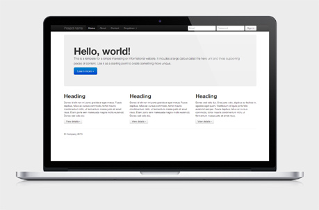
In the world of web design, to give a more straightforward definition, a framework is defined as a package made up of a structure of files and folders of standardized code (HTML, CSS, JS documents etc.) which can be used to support the development of websites, as a basis to start building a site.

Most websites share a very similar (not to say identical) structure. The aim of frameworks is to provide a common structure so that developers don't have to redo it from scratch and can reuse the code provided. In this way, frameworks allow us to cut out much of the work and save a lot of time.

To summarize: there's no need to reinvent the wheel.

The aim of frameworks is to provide a common structure so that developers don't have to redo it from scratch and can reuse the code provided

How many types of framework are there?

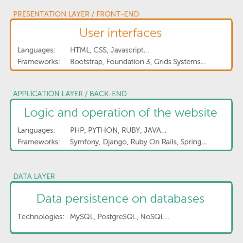
There are basically 2 types to differentiate: backend and frontend (this distinction is drawn depending on whether the framework is for the presentation layer or the application/ logical layer.

It's important to understand that frameworks are a conceptual notion: a pre-prepared standard kit from which to work. The concept of a framework can be applied to different processes carried out on the web: the programmer's layer which connects the database to the site content and uses PHP language, and the designer's layer, where that content must be presented in HTML documents with defined CSS style sheets so it can ultimately be viewed in a browser.

They can be backend (a set of files with libraries to access databases, template structures, session management) or frontend. We're going to focus on frontend frameworks.

Front-end Frameworks (or CSS Frameworks)

Frontend frameworks usually consist of a package made up of a structure of files and folders of standardized code (HTML, CSS, JS documents etc.)

    The usual components are:

  • CSS source code to create a grid: this allows the developer to position the different elements that make up the site design in a simple and versatile fashion.
  • Typography style definitions for HTML elements.
  • Solutions for cases of browser incompatibility so the site displays correctly in all browsers.
  • Creation of standard CSS classes which can be used to style advanced components of the user interface.

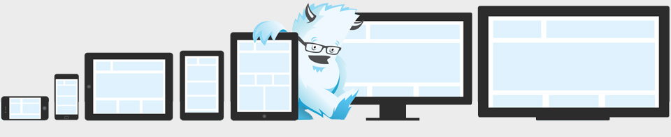
About responsive frameworks: Currently the rise of responsive web design techniques, which facilitate the development of websites that can adapt to various resolutions for different mobile and desktop devices, is leading to the emergence of responsive frameworks. That is, they solved the common problem of making a responsive site. These frameworks...to offer a responsive solution from the point of installation.

Selection of frameworks

Within CSS frameworks, we can draw a distinction between two types of framework according to their complexity: simple frameworks and complete frameworks. This distinction is subjective, and doesn't mean one is better than the others but rather that they give different solutions depending on the level of complexity and/ or flexibility required.

Simple frameworks

These are often called simply "grid systems" but are frameworks nonetheless. They offer style sheets with column systems to facilitate the distribution of different elements according to the established design.

  • The 1140 CSS Grid

    The 1140 grid fits perfectly into a 1280 monitor. On smaller monitors it becomes fluid and adapts to the width of the browser. Beyond a certain point it uses media queries to serve up a mobile version, which essentially stacks all the columns on top of each other so the flow of information still makes sense. Scrap 1024! Design once at 1140 for 1280, and with very little extra work, it will adapt itself to work on just about any monitor, even mobile.

    cssgrid.net

  • Golden Grid System

    A folding grid for responsive design.

    goldengridsystem.com

  • Mueller Grid System

    MUELLER is a modular grid system for responsive/adaptive and non–responsive layouts, based on Compass. You have full control over column width, gutter width, baseline grid and media–queries.

    muellergridsystem.com

  • Responsive Grid System, by Graham Miller

    Spectacularly Easy Responsive Design. Inspired by Ethan Marcotte's responsive web design, this site was set up in the spirit of giving something back. I found something that works for me, and I want to share it.

    responsivegridsystem.com

  • Titan

    A CSS framework for responsive web designs. Titan Framework comes in two versions, with 12 and 16 columns

    titanthemes.com

  • Responsive Grid System, by Denis LeBlanc

    Simple CSS framework for fast, intuitive development of responsive websites. Built using the 'Mobile First' approach, 'clearfix' for clearing floats, box-sizing: border-box for adding additional padding to elements, and weighs less then 1kb compressed. Responsive design isn't hard, you've just never used responsive.gs.

    responsive.gs

  • Less Framework 4

    Less Framework is a CSS grid system for designing adaptive web­sites. It contains 4 layouts and 3 sets of typography presets, all based on a single grid.

    lessframework.com

  • Gridiculo.us

    Gridiculous was created after I tried out a bunch of different responsive grids and realized that none of them offered all of the features I required.

    gridiculo.us

  • Columnal

    The Columnal CSS grid system is a "remix" of a couple others with some custom code thrown in. The elastic grid system is borrowed from cssgrid.net, while some code inspiration (and the idea for subcolumns) are taken from 960.gs.

    columnal.com

  • Toast

    Toast is a CSS framework as simple as it can be, but no simpler. A twelve column responsive grid makes layouts a breeze, and with box-sizing you can add padding and borders to the grid, without breaking a single thing.

    daneden.me/toast

  • Ingrid

    Ingrid is a lightweight and fluid CSS layout system, whose main goal is to reduce the use of classes on individual units. Making it feel a bit less obtrusive and bit more fun to reflow for responsive layouts.

    piira.se/ingrid

  • 960 Grid System

    The 960 Grid System is an effort to streamline web development workflow by providing commonly used dimensions, based on a width of 960 pixels. There are two variants: 12 and 16 columns, which can be used separately or in tandem.

    960.gs

  • Base

    Super Simple Responsive Framework built to work on mobile devices, tablets, netbooks and desktop computers

    matthewhartman.github.com/base/

  • Susy

    Responsive grids for Compass. Susy is based on Natalie Downe's CSS Systems, made possible by Sass, and made easy with Compass. You can use it anywhere, from static sites to Django, Rails, Wordpress and more. It even comes packaged as part of Middleman, to make your life easy.

    susy.oddbird.net

Complete frameworks

They usually offer complete frameworks with configurable features like styled-typography, sets of forms, buttons, icons and other reusable components built to provide navigation, alerts, popovers, and more, images frames, HTML templates, custom settings, etc.

  • Bootstrap

    Sleek, intuitive, and powerful front-end framework for faster and easier web development. Built at Twitter by @mdo and @fat, Bootstrap utilizes LESS CSS, is compiled via Node, and is managed through GitHub to help nerds do awesome stuff on the web.

    twitter.github.com/bootstrap

  • Foundation 3

    An advanced responsive front-end framework. Foundation 3 is built with Sass, a powerful CSS preprocessor, which allows us to much more quickly develop Foundation itself — and gives you new tools to quickly customize and build on top of Foundation.

    foundation.zurb.com

  • Skeleton

    A Beautiful Boilerplate for Responsive, Mobile-Friendly Development. Skeleton is a small collection of CSS files that can help you rapidly develop sites that look beautiful at any size, be it a 17" laptop screen or an iPhone.

    getskeleton.com

  • YAML 4

    A modular CSS framework for truly flexible, accessible and responsive websites. YAML is tested and supported in major modern browsers like Chrome, Firefox, Opera, Safari and Internet Explorer.

    yaml.de

  • Tuktuk

    Not trying to compete with Bootstrap or Foundation because they play in another league. Just worry about creating responsive and fully extensible sites easily.

    tuktuk.tapquo.com

  • Gumby

    Gumby Framework is a responsive 960 grid CSS framework which includes multiple types of grids with different column variations which enables you to be flexible throughout an entire project's lifecycle.

    gumbyframework.com

  • Kube

    CSS-framework for professional developers. Minimal and enough. Adaptive and responsive. Revolution grid and beautiful typography. No imposed styles and freedom.

    imperavi.com/kube

  • Groundwork

    GroundworkCSS has been built from the ground up with the incredibly powerful CSS preprocessor, Sass.

    groundwork.sidereel.com

  • ResponsiveAeon

    ResponsiveAeon is an elegant & minimalistic css3 grid system framework, now with a responsive grid all based in percentage with mediaqueries, html5 starting point and javascript.

    www.newaeonweb.com.br/responsiveaeon

How to choose the right one?

Choosing the right framework for my site is far from simple, for several reason:

      1. Every site is different and will require different characteristics. Using a very complete framework for a single page site may give an adequate result, but surely misses out on many resources.
      2. Currently there aren't many significant differences: they're all very complete and easy to use.

However, we'll give you some pointers to keep in mind when it comes to choosing a suitable framework:

  • Speed of installation: some are very simple to install and start using. Others require more time to configure.
  • Ease of understanding: some are a bit of a pain to get to grips with, complicated. Others, by contrast, are comparatively more straightforward.
  • Options: some frameworks are more complex than others and offer more configuration options, widgets and interface options. These will allow you to do better things with your site.
  • Integration with other systems.
  • Best long-term support: Some digital projects lack continuity in time and updates and support services stop. It's always better to opt for those that offer continued support guarantees. Many of them are supported by companies that offer other professional products on the market.

Advantages and disadvantages of using frameworks

Advantages

  • Speeds up the mock-up process
  • Clean and tidy code
  • Solutions to common CSS problems
  • Browser compatibility
  • Learn good practices
  • Having a single procedure to resolve common problems makes maintaining various projects more straightforward.
  • Helpful in collaborative work

Disadvantages

  • Mixes content and presentation
  • Unused code leftover
  • Slower learning curve
  • You don't learn to do it yourself

Is it advisable to use a framework?

Not necessarily. The developer must take the final decision on whether or not to use a framework. This will depend on several of the issues we've looked at. Frameworks are a resource that can be extremely useful for many people, but that doesn't mean they are necessarily useful for you. Now you know what they are, which ones are out there, and the advantages and disadvantages of using them.


courtesy: http://www.awwwards.com/what-are-frameworks-22-best-responsive-css-frameworks-for-web-design.html